The Refreshed Minterest Brand
Dear Minterest Supporters,
Over the past few months, we’ve been hard at work behind the scenes crafting a new chapter in the Minterest journey. And as a small, but important, visual marker to represent this moment we decided to do a refresh to the Minterest brand identity. For the team, the exercise has been reinvigorating, perhaps a bit cathartic too. And though minor, the output is something that we are proud of.
Typically, this form of work is done in isolation and the results simply appear across brand properties once completed. However, we thought that sharing the behind-the-scenes process for conducting the refresh might provide an interesting glimpse into the way our team thinks and operates.
We have included plenty of visuals, drafts, and work-in-progress pieces that eventually culminated into what you will now see across all of Minterest’s properties.
A Fresh Feel
Conceptually, we loved the earlier look-and-feel of Minterest. The purple motifs and darker accents really stood out, and they felt professional. So the goal was not to do a major rebrand or alter the overall approach. Instead our team wanted to reevaluate what the brand projects with fresh eyes, and ensure there is consistency around its overall theme.
The journey began with the brand’s colour language. As an infrastructural product focused on decentralised finance, Minterest needs to exude safety and security first and foremost.
We explored over 15 different colour schemes and styles combinations, closely evaluating both the latest trends and classic evergreen styles used by respected brands for decades in finance. Some of the options were certainly bold ones which attracted attention as early favourites as you will see in the visual below.
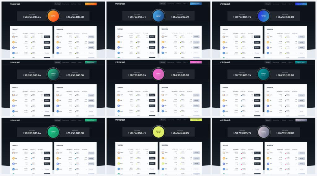
Internal biases will always be there. So, to gain perspective, we invited a select group of individuals into our creative space and showed them different variations of the brand colour options under consideration. It quickly became apparent that what works well for eye-popping visibility doesn’t necessarily translate to communicating safety and security in managing people’s finances (here’s looking at you, fluorescent orange). Additionally, some of the choice options were simply overused across both finance and social media. We took the feedback and dug deeper to refine our options.
The Final Pick
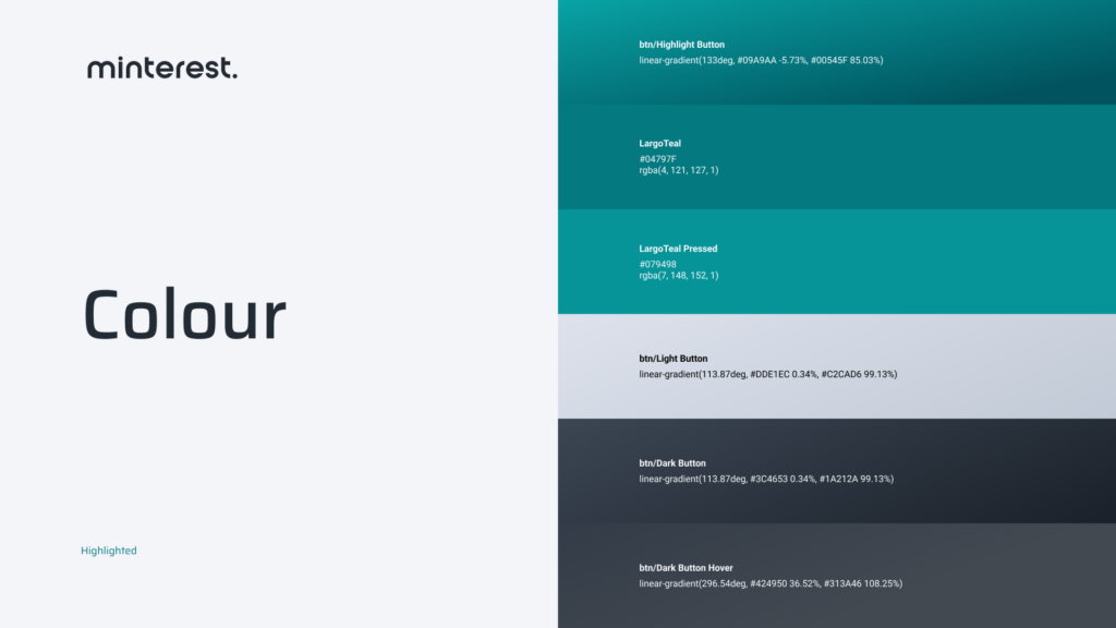
We arrived at a colour palette that combines the calmness of nature (green) with the innovation of technology (blue). It’s a harmonious blend that encapsulates the essence of Minterest — a secure, professional, forward-looking DeFi platform. And, everything thematically aligns around the essence of the mint leaf.
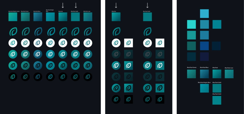
We sketched out all Minterest assets in this palette, ensuring they resonated throughout the product. And finally we were able to craft an extensive brand book with the new approach that will be utilised by our designers and partners.
Product Re-Branding
We carried this colour refresh across the Minterest website and associated social content platforms.
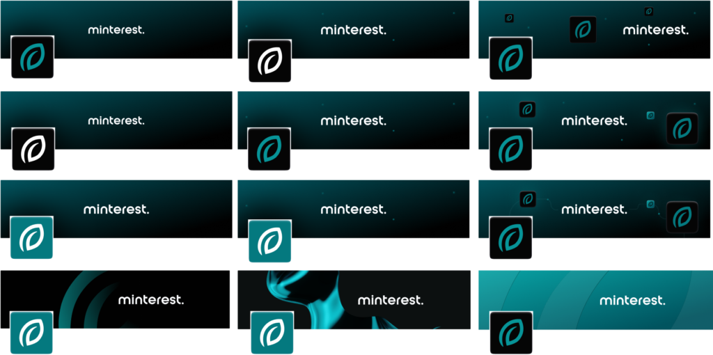
The Minterest token icon — the heart of the Minterest brand — got some TLC too. The team made subtle adjustments to the size of the leaf, colour combinations, and the shape of the coin icon to provide a bit of a visual lift.
The new colour palette really aligned well with the recent rebranding of the Minterest token ticker symbol to MINTY as it symbolises more than just a token; it has a playful nature that brings to mind child-like enjoyment akin to “minties” — refreshing candies that leave a memorable taste in your mouth. We had some fun playing around with that concept, with more to come in the future.

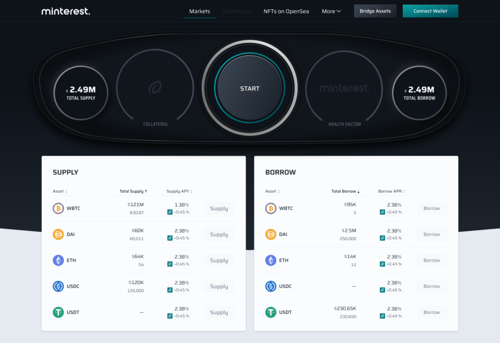
The Minty-er Minterest App
The Minterest application should be intuitive, user-friendly, and efficient — just like the dashboard of a car, where crucial information is clear at a glance, but where deeper insights are always at your fingertips. The visual refresh certainly improves readability and makes it easier to navigate the app since there are now fewer contrasting elements.
Final Thoughts
As we share insights for refreshing the Minterest brand, we do reflect on the journey taken until this point and how the process led us down a captivating rabbit hole of creativity for several months.
Even after finalising the “winning” style, we fine-tuned it for even better resonance. Every nook and cranny of the Minterest app needed a new brand review — from the navigation bar to modals and even dashboard gauges. It’s a meticulous but necessary process to ensure a seamless user experience.
In the end we are really satisfied with the new look-and-feel of the product, and how it all came together piece-by-piece. Kudos to the entire product team and Minterest ambassadors for their incredible support in helping to refresh Minterest.
The updated design is now a foundation to build from and we have quite a bit more work coming down the pipeline as the Minterest app expands to incorporate more features moving towards its public launch. Stay tuned.
28, September 2023